A picture is worth a thousand words…
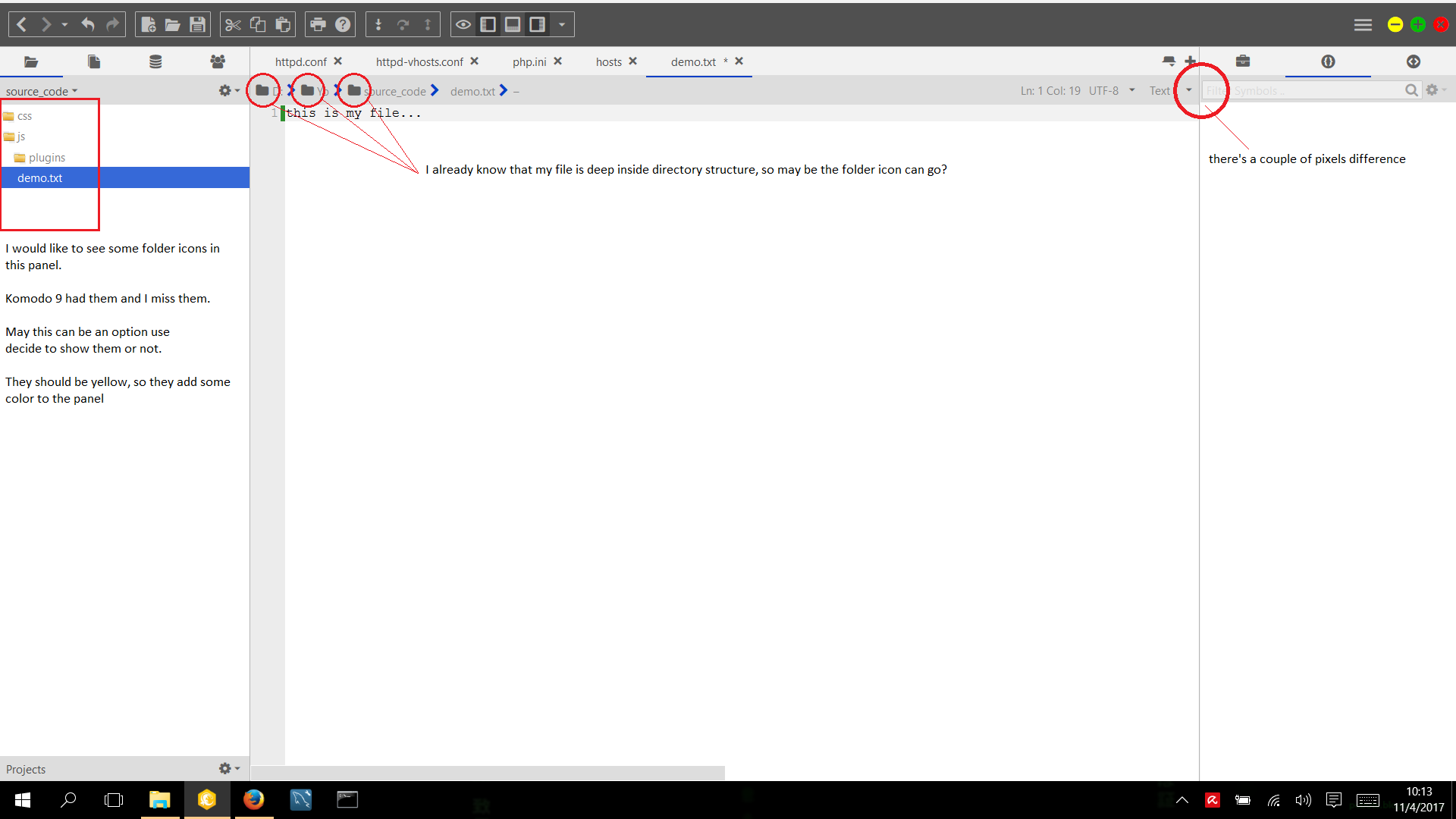
I’m a bit confused by the contradiction you have in your image; you say you already know your file is in a folder structure so loose the folder icon, but then you request folder icons for the Places widget where it is also evident that files are inside folder structures (further made evident by the chevron icon). Could you explain your state of mind?
As for the “couple of pixels difference”, are you talking about the padding? That is intentional, we don’t want textboxes sticking against borders.
First, the simple one, I’m talking about the gray box where the textbox is, that box is not the same height as the same gray box of the middle panel (middle and left panel wave the same height). If this is not clear I’ll send another image…
Now the “folder icon” issue…I understand the confusion. Let me explain:
On the left panel, I have a tree estructure of directories, I can go deep inside until I find the file I want to work on. In this part of the IDE I like to see yellow icons of folders (not flat, by the way) And this could be an option to see them or not (so everyone is happy)
But in the breadcrumb, I don’t feel the need to se that icon because it is another way of representing the parent(s) of the file. Besides, without them we have more space to show more breadcrumbs
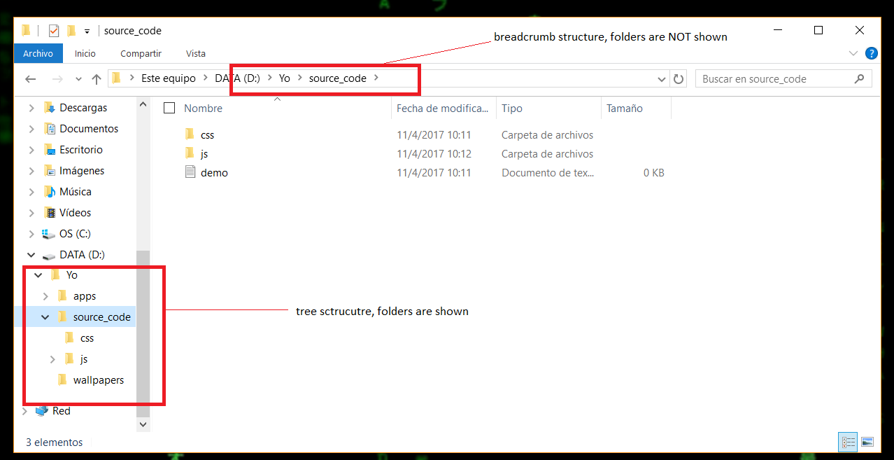
And as an example, let me show you how windows 10 manage the same scenario
This sounds like a bug with the classic theme (which you’re using), the Default theme shouldnt have that. I’ll look into it. Thanks for reporting!
I feel like the same goes for the Places widget; the folder icons are redundant there. It is already expressed by the label color and the chevron icon.
If windows folder icons were always the same I would say the same goes there, but Windows uses different folder icons for different sections, so it’s more relevant.
For what it’s worth, you could add folder icons by using the following CSS in your color scheme:
#directoryTree treechildren treeitem[type="folder"] {
	background-image: url("koicon://ko-svg/chrome/icomoon/skin/folder2.svg?size=14&color=%23D7BF74") !important;
	background-size: 14px !important;
}

#placesViewbox_placesWrapper tree  treechildren::-moz-tree-twisty {
	background-image: url("koicon://ko-svg/chrome/icomoon/skin/folder2.svg?size=14&color=%23D7BF74") !important;
	background-size: 14px !important;
}

#placesViewbox_placesWrapper tree treechildren::-moz-tree-twisty(open) {
	background-image: url("koicon://ko-svg/chrome/icomoon/skin/folder-open.svg?size=14&color=%23D7BF74") !important;
	background-size: 14px !important;
}
May be…for me the left pane looks to flat and colorless without the icon. Do you think this could be a option in a future release. To toggle the folder icon.
There have been quite a few requests for it so it’s likely there’ll be an option for it at some point.
Good to know!! I hope this will available soon. Really looking forward this option!!!
Finaly I opened the arrows in Photoshop, inverted the color, moved them 2px down for perfect aligning and said Ok. Sometimes the methods from stone age are the most functional.