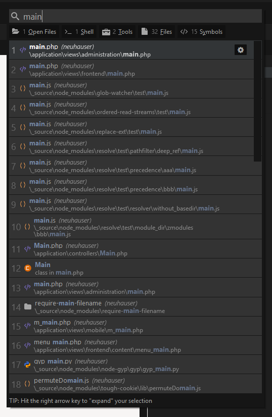
the result list in comando search is very crowded and confusing, theres so much text to read, and the results are displayed in random manner. I can hardly find anything if there are many matches:
Do we need the project name next to the file name? I think not as we are currently working in this project.
The results should be also ordered in a customizable direction (last usage, file endings, maybe a 2nd level ordering: first by extension, second by filename) and so on.
This is a very fundamental ui/ux requirement and essential for daily work.
The results are ordered on relevance to your search query, that is their very purpose. It has been like this since version 9 and this is the first time I’ve seen someone complain about it. I’m not against improving it but I have to say I’m not convinced that it is warranted.
That said, you make a good point about the redundancy of the project name. I would still like to convey that this is a project file (results CAN show that are outside your project depending on how you are using Komodo), but that could probably be done much more covertly.
The main design philosophy behind Commando is that if you cannot find something easily you can just continue typing your query. As per your screenshot you could just continue typing “main front” and it would only show matches where both “main” and “front” are in the path.