In or near the center of the Editor Pane is a group of nine buttons. All of these are redundant, and duplicate commands accessible from the main menu – and thus they are a waste of space and seem like an attempt to fill up the empty area of that pane. I suspect most developers would prefer more of a “blank canvas” when starting fresh.
You can already do this by hitting the “New File” icon in your toolbar or rebinding eg. Ctrl+T for “New File”. The pane you are talking about is the “New Tab” pane, it is not an editor.
Thanks for the info on the name of the pane. Just to clarify, I wasn’t stating that it is an editor, but rather that it is located in the center of the Editor Pane.
Regarding the techniques for creating an empty new file, yes, I was aware of the menu option. But this issue is not about how to start a new file but rather the redundancy and visual excess of the buttons within the New Tab pane.
I have to say that I don’t agree at all with this assessment (that’s what this part of the forums is for! ![]() ). A New Tab is exactly where these buttons should be. I use those buttons often and they are strategically placed so that you only see them when you need them (eg. you have no files open and want to quickly get started on something).
). A New Tab is exactly where these buttons should be. I use those buttons often and they are strategically placed so that you only see them when you need them (eg. you have no files open and want to quickly get started on something).
I don’t want to use menus ever but I will when I have to. If there is a button I will use that. If there is a keybinding I’ll use that over buttons or menus.
- Carey
In addition to what Carey said keep in mind that the toolbar and its buttons are optional, they might not always be visible for everyone.
Redundancy in UX is not always bad.
Thanks to both of you for your thoughts on this. I guess it boils down to personal preference. I’d rather have no buttons whatsoever, with all commands logically organized in the menu system, so there’s always exactly one way to execute any given command (aside from customizable key bindings, which I end up using far more than anything else). I find that the more buttons in an interface, the more it appears cluttered and, in cases where there’s a large number of commands, you can end up with a Photoshop-style UI with dozens and dozens of difficult to read buttons. Anyway, to each his own.
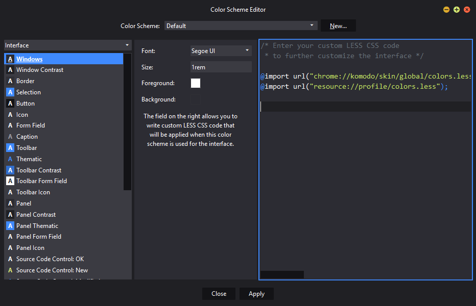
You can hide them using custom CSS in color scheme editor.
[anonid="quickstart"] {
    display: none;
    /* or */
    visibility: collapse;
}
I don’t know the difference though, but both of them works for me 
Thanks for the suggestion. Within the color scheme editor, where does one find the custom CSS section?
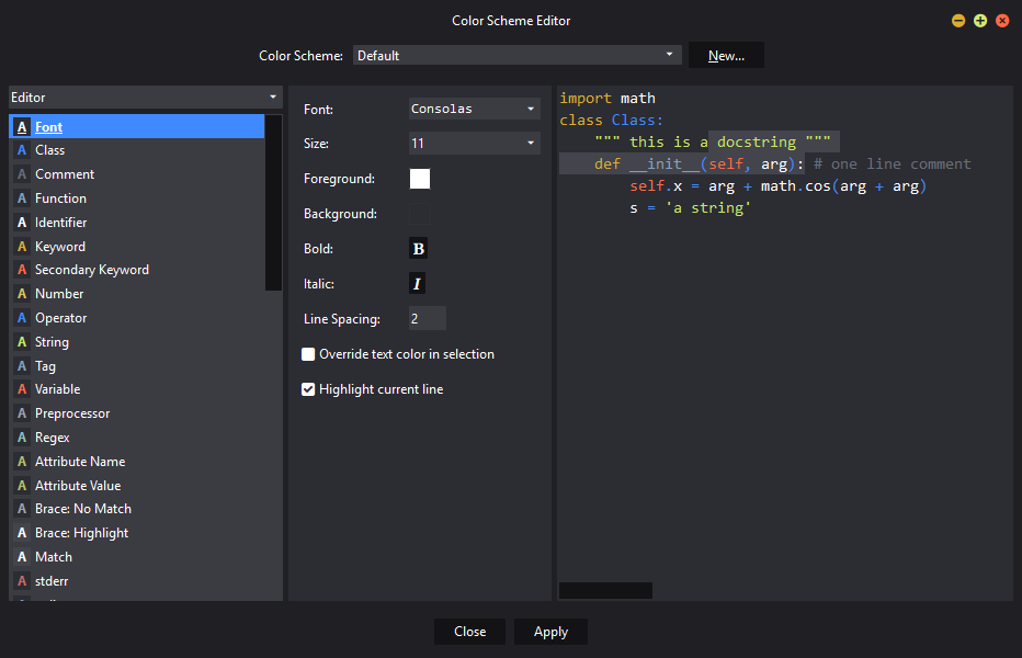
Select the Interface item in the left-top dropdown menu (the “Editor” label). The right pane would represent the css editor.
Thanks. At first the “Editor” label appeared to be a static label bar, and I didn’t realize that it had options within it. So the custom CSS would be put into the right-most panel?
Yep.
Cool. Thanks!
You’re welcome 

