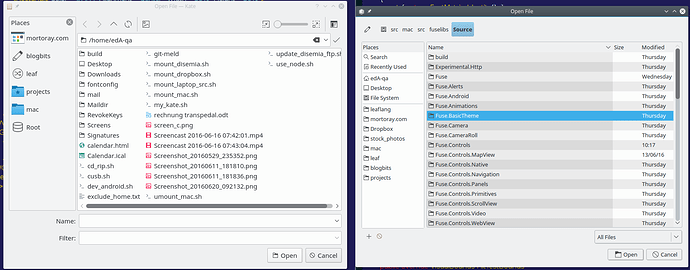
One KDE I’m use to using the standard file dialogs, but Komodo is using a slightly different dialog.
Here’s a comparison, on the left is the KDE open dialog, on the right the Komodo one.
I don’t really care about visual variation, but there are a couple things that I dislike in the Komodo one:
- It isn’t respecting my single-click to open settings. I need to double-click on folders/files to open them.
- It’s stuck in a details view as opposed to a columnar view that shows more files per page
Our GUI toolkit is based on GTK. As I’m sure you’re aware, GTK and Qt (used by KDE) differ in some aspects. The behavior you don’t care for is sadly the GTK defaults. I did a bit of searching to see if I could find a way to enable single-click selecting of files in a GtkFileChooser dialog (for GTK 2, not GTK 3), but didn’t see anything right away. You may find something that works though. I think the list view is hard-coded and unchangeable.
Sadly, there’s not much we can do about this 
Komodo is based on Mozilla, which uses GTK, not QT. As such you are seeing a GTK file picker dialog rather than the QT one. I don’t expect this to change any time soon.
More info on the topic:
Okay, so it’s GTK’s fault for having a lacklustre file dialog. I’ll follow up with GTK to see if there’s something I can do.
Well, I guess we can give up on GTK ever fixing this. They’re been arguing about it for 13 years: https://bugzilla.gnome.org/show_bug.cgi?id=121113
1 Like
I never knew a bike shed could have so many colors.
1 Like

