Legacy styles

I apologize if this is in the wrong category.

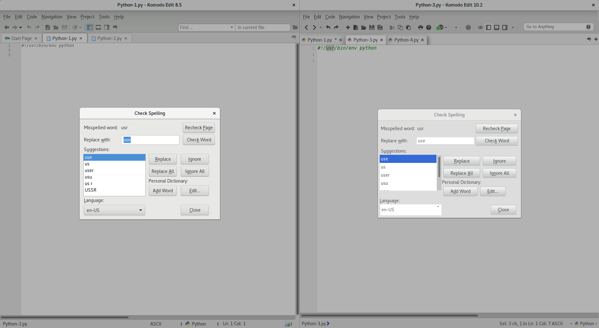
I have been using Komodo for a very long time and I stuck with 8.5 after the gui changes in 9+ because Komodo is really an excellent editor, however I would like to take advantage of the newer versions, but I can not bring myself to do it because of the styling that was introduced.

Is there any way to make the current Komodo look exactly like 8.5? Same window style, colors, etc?

The borderless windows and menus, etc. are not appealing and I find it all distracting.

I have seen in threads from a long time ago that there are people who have felt the same and probably moreso the older people like myself, and I am hoping we do not have to be forced out of using this program or to use a lesser version because of this preference.

You obviously want to go in a more modern direction and I respect that, but I think bringing back the older interface as an option makes sense.

Again, I think it is less about color and more about the window styles. The borderless windows and menus I think are the major problem for people like me with these same complaints.

I really like Komodo and will continue to use 8.5, but I decided to make a post about this just in case I was missing something.

Hey @jonk,

Thanks for your post and thank you for your understanding most of all!

To start, open up your prefs in Komodo 10 ( Ctrl + , ) and select the Appearance preferences. Find the Platform Integration section. Enable the following options:

  • Enable Classic Mode
  • Use native window borders
  • Use classic toolbar layout
  • Place statusbar below editor

If you select all 4 of those options that will bring you pretty close to the classic look of Komodo before Komodo 9.

We took the criticisms of our users over the UI changes seriously and did our best to accommodate.

Let us know what you think.

  • Carey

Thank you for your quick response.

I have to say it is not completely terrible, but still not quite the same, which is to be expected.

I did a side to side comparison and there are a few main differences, although small, it changes the whole experience.

The new interface is extremely rectangular and very flat. Even the simple difference of the “find” input being rounded edges would be an improvement. The icon sets having their own set of borders just feels wrong. Also the status bar not having any upper border makes it feel weird (although this may just be a default color setting or something, I don’t know).

The gradation in the toolbar of 8.x is a huge difference as well (and I guess that is more from the time period and probably inherent in whatever gui framework) because it helps tie the menus together, but that is really less of a problem.

Everything just feels very flat, which I think is probably the main underlying issue with the new interface. It is like office 2016 and perhaps this is a trendy type of design and perhaps that is what you were going for, but I can’t imagine a lot of the older users like myself care for it.

With these basic changes it would pretty much be the old interface.

With this being said, isn’t it feasible that these changes could be made in a skin? I am not very familiar with the skinning framework used, but dealing with styles is pretty basic.

For icons, couldn’t I just use the 8.x iconset and integrate that somehow? Can background images be applied and just use a gradation (although this is just to make it the same, I think having same color is acceptable)? Can the menu bar have separate font than the rest of the document? Same with status bar?

It seems like these things would be pretty simple to deal with, although I am not well versed in the theming framework or the limitations, but really how hard could it be. I guess it is the same theming framework as firefox?

I can’t imagine I would have to devote too much time to make these changes work, again it all seems pretty basic, simple adjustments that would make all the difference.

I have read a lot of the previous forum posts some with seemingly hostile posts and responses, and it seems like many long term users are unhappy with it, and it seems like something extremely basic to improve. Am I wrong?

It is indeed possible to make these changes in the color scheme, hit Tools > Color Scheme Editor. Select the color scheme you want to “modify” and hit “New”. Now from the left dropdown menu select “Interface”. Once you have the interface selected you can use the text field on the right to write custom CSS.

You can use the DOM Inspector to figure out the structure of Komodo’s UI so you can write the appropriate CSS rules.

Komodo’s UI is tailored after modern UI conventions, which like it or not are decidedly “flat” and “square”. It’s unlikely we’ll be changing this unless modern UI conventions also change. That said Komodo’s new UI was designed very much with customization in mind and we fully support people to roll their own color scheme configurations. Please let us know if you need any help.

Thank you for your response.

I tried to be as thoughtful, honest and most importantly as constructive as possible and I have to say that I do not appreciate the last portion of your response, which I noticed to be a pattern in your responses about this topic. By saying it is “flat” and “square” should not be quoted, because it is a fact. Whether someone likes this fact or not is the issue here.

I was simply trying to think of a solution that would accommodate people like myself who do not care for this great “modern UI convention”. A lot of software has gone this same direction and it has all received a lot of criticism as well and that is all fine everyone has different preferences…

I understand you are probably tired of hearing people share their opinion about it, but the fact of the matter is there seem to be many people that do not care for it, and we are all just looking for solutions (the same solution) to this very basic problem.

I appreciate your advice and input on how to alter everything.

I quoted those words because they are not exact terminologies. I meant no disrespect.

My apologies for responding in that tone, although it would be warranted even if you did lol. I am sure it is very annoying to hear the same issues over and over.

I am going to try to see if I can create some sort of style that can be similar to 8.x and I will respond if I feel it is good. Perhaps I can help some other users in my situation to adjust.

It’s all good, honestly this is probably one of the most constructive posts I’ve seen on the subject. Most people when offering their feedback tend to be a bit hyperbolic.

What platform are you on? I have a color scheme in development for Windows that blends in more with the OS. However since Windows itself is quite “flat” these days the color scheme is also that. I’m not aware of any existing color schemes that play with gradients, but as you said it should be very simple and straightforward.

I primarily work on linux with gnome desktop which actually does have similar style, but I do use Windows as well. I am sure the styles of Komodo can be adjusted to be similar to the old versions, it is really just a matter of the borders and colors I think. Are gradients possible whether it is background image or just pure css?

I am unsure of the limitations or what css features are applicable. Are there any docs about the theming framework used in Komodo?

Komodo is based on Mozilla (same as Firefox), so in regards to styling anything that applies to Firefox also applies to Komodo. Aside from bleeding edge stuff everything should work though, except for position stuff.

As for gradients, you can use both images or just pure css. If you use images I would suggest you base64 encode them, so you don’t need to worry about hosting them somewhere (locally).

Note that the CSS in Komodo is actually LESS, so you can do anything LESS does.

Awesome. I’ll see what I can do.

I was pretty successful in getting it to look very similar to 8.x. This was on linux so it kind of looks like a gnome theme.

I did very quick and dirty styles, and I didn’t update the icons because I didn’t really spend too much time looking into how to do that. Perhaps I will put it together as a skin to make it easier for me to import on windows and also if others were interested in styling like this.

What do you think about it?

I was a version 6 affectionado then upgaded to v10. It’s usable but I really miss the “show in file manager” or “open in explorer” feature of the r-mousing on the tabs. The workaround is to r-mouse -> show in Places" then r-mouse that highlighted item, then you get the open in explorer item. -or- you copy/paste the url into another explorer window.

  • the full find dialog was nicer and more intuitive.

  • I extensively used the (outdated) morekomodo add-on so that I could save selected search results to a new file( with the format option). Now, I have to hit the “copy to clipboard” button of the entire search contents, then past into excel to delete unwanted columns etc. But at least the copy feature is now there by default.

It was great, now it’s only good but improving… -Lee

That’s still there, but it’s only an option from the Places widget (always has been).

I would recommend you open an enhancement request for having column copying in find results, that sounds like something we ought to be able to add with relative ease.

Thanks Nathanr
I’ve been sticking to using version 10 and getting more used to it.

Hmm, the “show in file manager” was on the tabs but maybe that was after the morekomodo addition installed .?.

It’s growing on me: using the “find in places” then going over there to open in explorer now. thanks, -Lee