In Komodo X we have the new Color Scheme Editor, this allows us the customize the color scheme and has a new part where you can edit the look and feel (skin) of komodo X.
I’m loving this new feature, it even lets you add custom less to your skin.
So i thought lets share our customization tips and tricks.
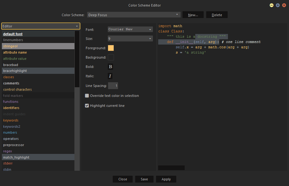
In the new color scheme editor you can edit the color scheme:
In the top left corner you have a dropdown, this allows you to switch to the part you want to edit.
The editor opens in the editor screen, here you can adjust the main color of you’re color scheme.
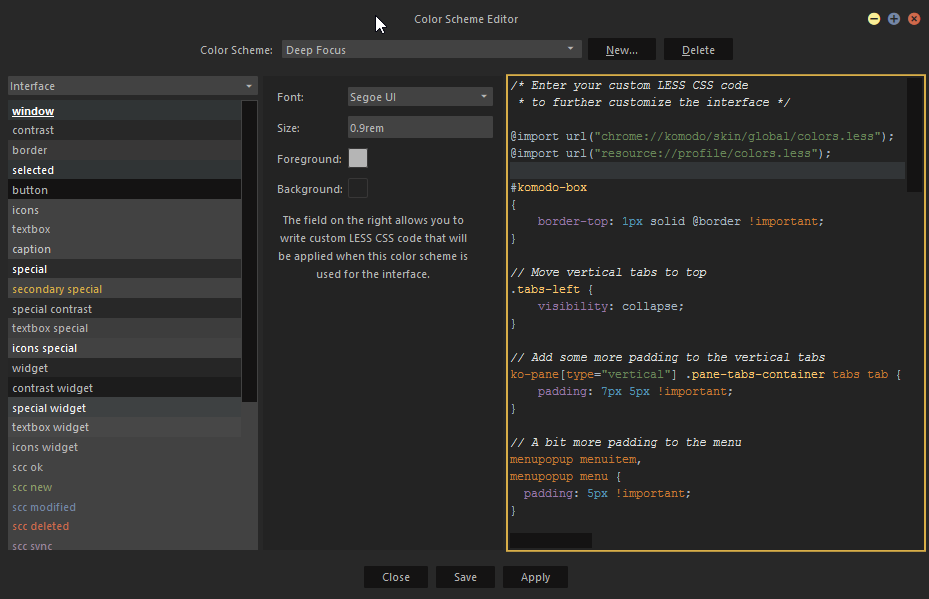
The interface option allows you to edit the skin part of komodo:
Here you can adjust all the skin settings and on the right side you can even add you’re own custom css.
This allows you to make changes, you would normal only can achieve trough a skin.
To add custom css you first got to know how the elements are named before you can style them, luckily there are two addons that can help you with this:
The DOM inspector and the Element Inspector
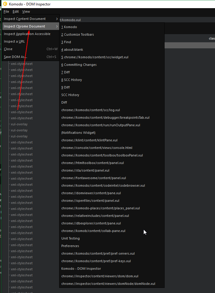
This allows you to inspect the element as you nomarly would do with something like firebug:
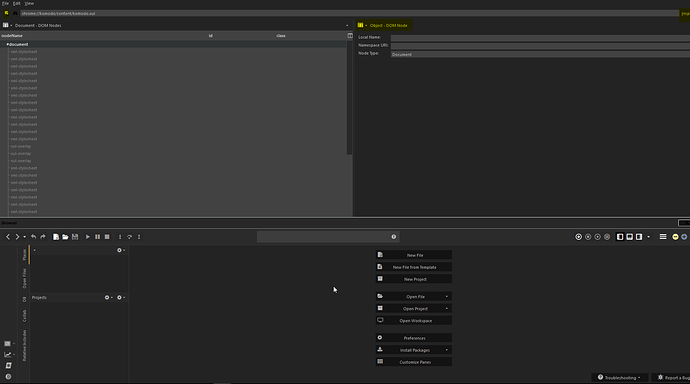
On the top right corner you have the inspect button, when you click on this a browser window will open in split view (as seen in the img), with the top left button you can select the element you want to inspect.
In the middle there is a dropdown where you can switch to the information you want to see from the element:
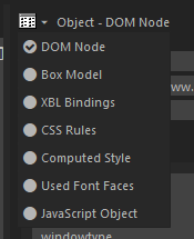
If you go to the CSS rules you can see witch CSS rules are applied to the element, witch you can use in you’re custom css to overrule.
You can also see the computed style of the element.
If you right click on a item you can even go to the line in the css file.
If you look to you’re custom less you can see two import rules:
@import url("chrome://komodo/skin/global/colors.less");
@import url("resource://profile/colors.less");
This will import the colors in you’re color scheme, the top one are the default colors.
And the other are you’re custom colors from you’re profile.
If you look inside the top file you can see witch less variables you can use inside you’re custom less, so you’re changes will also match when you change you’re colors.
In my new color scheme I have some custom less rules i wanted to share:
In vertical tab layout the labels are positioned in the middle of the screen, to move them to the top you add these lines of less:
.tabs-left {
    visibility: collapse;
}
I also made the breadcrumb arrow a bit smaller and gave it a bit more space:
[anonid="breadcrumbBar"] .breadcrumb .breadcrumb-arrow {
    font-size: 10px !important;
    margin: 0 5px !important;
}
Added a bit more padding to the menu, so it’s easier to handle:
menupopup menuitem,
menupopup menu {
  padding: 5px !important;
}
Splitters are currently a bit difficult to handle, so added these lines to fix it:
.widget_splitter[orient="vertical"],
#placesSubpanelSplitter[orient="vertical"] {
    padding-top: 2px !important;
    padding-bottom: 2px !important;
}
And added a border to the mini-map:
#tabbed-view tabpanel minimap {
    border-left: 1px solid @border !important;
}
Someone else got some cool tricks to customize Komodo X?
