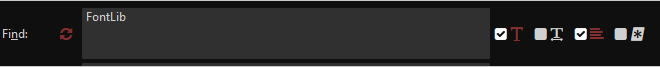
When doing Edit > Find or Edit > Replace, four icons are displayed to the right of the “Find” field. The first one specifies whether and how to match the case of the letters, and the third one allows multi-line search strings; both are obvious in their operation.
But the same cannot be said for the second and fourth icons. The second one specifies whether to match whole words. Clicking it changes its color; the particular two colors depend upon the chosen color scheme, e.g., anyone using the Default color scheme will see the icon go from white to blue, and anyone using the Cupertino scheme will see the icon go from gray to a lighter gray. Neither color change actually tells the user whether the Find operation will or will not match whole words. So the first thing the user does is hover the mouse pointer over the icon, in the hope that a tooltip will appear to say whether or not whole word matching will take place. But regardless of which of the two possible states the icon is in, in both cases the tooltip text is identical, namely, “Match whole words”. So the user doesn’t know. And for users who have difficulties differentiating some colors, this would be even more frustrating.
The fourth icon specifies whether to use regular expressions during the Find operation. Just as with the second icon, the color changes and the (unchanging) tooltip provide no helpful information to tell the user which state of the icon will use regexes and which one won’t. The only difference (compared to the second icon’s behavior) is that for this fourth one, in one of the two states, an additional icon appears to the right of it, with the tooltip “Open in Rx”, which is a good clue for anyone who knows what “Rx” is, but isn’t for anyone who doesn’t know.
Recommended call to action:
Modify the tooltips to indicate when the whole words and regex icons are in active states, such as by appending “(disabled)” to the end of the current tooltip text to show that feature is OFF, or rewording them, e.g. “Use regexes” and “Do not use regexes”.
If time and other resources allow, add icons that depict the active state.
If time and other resources allow, make the shading of the disabled icons a gray rather than a bright white.
Thanks for this. I have to ask though, is it not made obvious by every other icon in the panel that one colour/shade means enabled and one colour/shade means disabled? Especially in the default colour scheme, the use of a bright blue to indicate ON works really well.
If more people agree with this and the icons mentioned above exist in the set we use for Komodo it shouldn’t be too hard to do this but I don’t think I see the issue you’re seeing @mjross but my opinion doesn’t hold much weight in this scenario as this change would be geared to ramping up new users. It would have little to no effect on vet users.
Hello, Carey, and thank you for your reply. Yes, in general, when an icon toggles back and forth between two colors, it’s clear that doing so is alternately enabling and disabling the feature in question – at least to we majority of users with decent vision. But in this case, the crux of the problem is that there is no indication as to the meaning of the two colors. When an icon is lighter in color, is it enabled or disabled? When I first began using Komodo IDE and the Find feature, I would click those icons and see the colors change, and wonder, “OK, I’ve toggled a feature to a different state, but is it now on or off?” I would then check the contents of the tooltips in the two different states, expecting them to tell me whether the feature is enabled or disabled, only to be frustrated to see that the tooltips do not change. I can only imagine how frustrating that must be for users who have color vision problems. Yes, in the default color scheme, the bright blue is a lighter shade, but in most UIs that indicates a button is disabled.
Yes, we could wait to see how many people vote for this change request, but personally I do not think a low vote count would imply that this change should not be implemented. Of all the users of Komodo IDE, what fraction have accounts on this website, and of those, how many regularly visit, and of those, how many actually vote?
For the sake of maximum benefit with minimum work, setting distinct tooltips would be a big help and not require icon or color changes, e.g., “Use regexes” and “Do not use regexes”.
Yes I got your point but what I’m saying is that all the other icons should have told you what each colour meant. As you already said, Multi line and Case sensitive are obvious. Therefore you can go by those state changes; Multi Line is obvious because it changes the UI state so I KNOW it’s enabled when it’s blue. Now I know blue is on.
I don’t think that’s true. What i consistently see on my desktop right now is a grey shade means off and a bright colour means on whether that colour be blue, red, green or any other colou. That is exactly what the find dialog does in the default colour scheme. I can’t think of an example where blue is used to indicate off in a UI. Lack of colour usually means off.
If no one else shows interest in the idea then why would we implement it? That is the purpose of this portion of the forum. We don’t have a formal ratio for deciding what gets implemented. So far it’s just been if more than just the person suggesting it thinks we should do it then and it’s a reasonable ask on the current team resources then file it and prioritize it.
That’s a good idea. I’d change it slightly to not have the description change. I would append (disabled) to the end of the tooltip.
Yes, the behavior of the other icons can help the user in figuring out the second and fourth icons, but I would argue that the behavior and tooltips text of each individual icon should be able to stand on its own, i.e., it should be clear to a new user without having to refer to nearby icons.
I see what you’re saying, but as I consider it more now, I’m thinking it depends upon the colors in question (and not just a blanket “lighter shade” statement as I made). For instance, we are accustomed to seeing button text and link text that goes from a black or dark gray, to a lighter (and, technically, brighter) shade of gray, to indicate that they are disabled. On the other hand, you can point to buttons where a brighter non-white color indicates enabled. In the case of the regex icon, it goes from white to blue to indicate that it is enabled, and does not go from a darker blue to a brighter blue. To put it simply, I don’t think it is clear that the blue indicates enabled and the light indicates a disabled – it’s just not enough info.
That certainly makes sense, and I can really empathize with the balance between change requests and team resources, having been in that position myself for a couple decades. But to answer your question, I would argue that it should be implemented not based on how many people happen to see this request and vote for it, but rather because the current color changes and unvarying tooltips text do not present enough info to the user, especially a new user or one with color vision difficulties.
That would be fine. Anything that clearly indicates the current state.
I guess in this case it would have been better if the disabled state was more grey than white.[quote=“mjross, post:5, topic:3817”]
but rather because the current color changes and unvarying tooltips text do not present enough info to the user
[/quote]
You could say that for a lot of things. We have to have some sort of guide lines that are measurable. How do you measure UX impact with out a large amound of data? This isn’t helping this discussion though. If you want to discuss this further I recommend you open a new forum post.
This seems to be spiraling a bit into debate rather than specific work items. I think we could make this a lot more succinct.
So it’s:
add tool tip to indicate active state
if they are available, add an icon that depicts active state
make disabled icon shading a grey rather than white
Does that sound right? If it does could you add them to your initial post as a “call to action”? Then people don’t have to read through our discussion to get the details.
All done.[quote=“careyh, post:6, topic:3817”]
If you want to discuss this further I recommend you open a new forum post.
[/quote]
I didn’t have anything further to add. By the way, in providing feedback on Komodo IDE and going into the details sometimes, I’m not trying to be a pain in the neck , but rather really want to see the product be the best it possibly can. What you and the other team members have created is truly fantastic and now my favorite IDE.
Thank you, Carey. I sometimes worry that an overly negative message is being conveyed since the technical bugs and suggestions that we discuss in the forums and in the issue queues, on a cumulative basis, may seem like nothing but criticism. Yet we are really discussing only blemishes on a stellar product that makes software development so much easier. Be well!
It’s the nature of those mediums. I interpret yours and other users participation in these forums/git issues/other as an indication that you like/love Komodo because you care enough to report issues. That can be REALLY rare!
 But to answer your question, I would argue that it should be implemented not based on how many people happen to see this request and vote for it, but rather because the current color changes and unvarying tooltips text do not present enough info to the user, especially a new user or one with color vision difficulties.