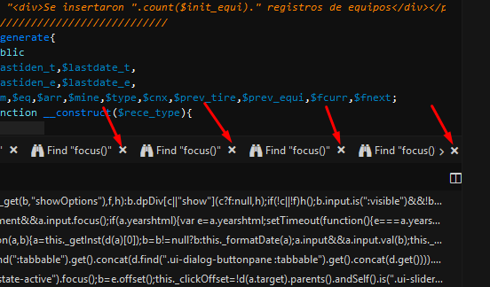
this is a little issue I found today on the bottom pane, you can have many tabs, sometimes they cover the pane and something like this happen:

As you can see every tab has an X to close it, but the last X is to hide the pane, not the tab.
I would like to customize the “pane X” to make it different to “tab X”.
(And I would like to recommend to change it in future Komodo versions too).
Defman
2
There’s an arrow that you can click on to scroll through the tabs you’ve opened. The X thing will be there.
Yes, I don’t want to remove the X, I want to make it “different” to avoid ambiguity, they are too similar for me.
Maybe changing the color, size or position 
careyh
4
I’ve run into this before. I think making the x slightly bigger, which to me implies that it’s for the “larger” scope in the UI.
I think this warrants an enhancement request.
1 Like
Hi there, could you please report this on our bug tracker? See nav bar above  Thanks!
1 Like

