I’m liking much of what I see in the Komodo 10 pre-release builds. I’m currently using the following version, according to the “About Komodo” build info:
Komodo IDE, version 10.0.0-beta1, build 89113, platform macosx.
Built on Fri May 6 01:55:28 2016.
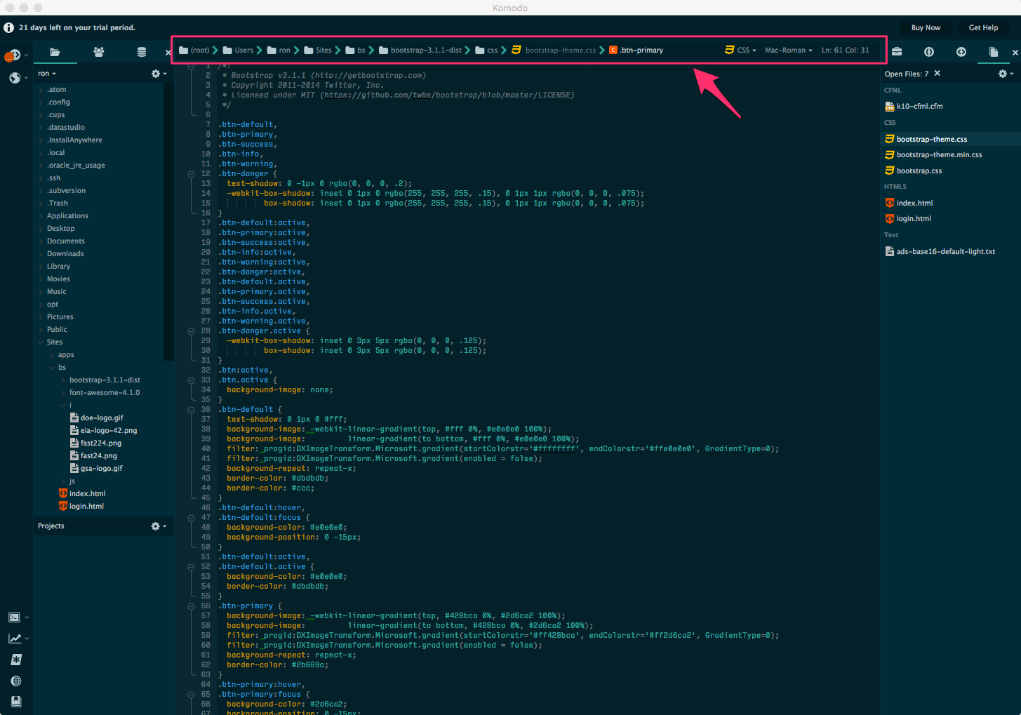
A couple of comments/questions regarding the “status bar” in Komodo 10 (not sure if that is what it is actually called, so I’ve pointed it out in the attached screenie). I will preface my comments by saying that I don’t use the status bar very much (which might be some sort of character flaw on my part).
I find most of the content of that bar to be visually pretty noisy and would rather not have it at the top of the edit area. Is there a way to move that bar to the bottom (where it has been in previous versions of Komodo)?
This is related to the visual noise aspect of my comment, above. I am a keyboard person and as I move around within the file, I find it really distracting to have the file-type icon shifting left and right as the line number and column number change width based on those values changing. Is there a way to make that portion of the status bar where the line # and column # a fixed width, sufficiently wide, to prevent that constant shifting?
I’m willing to submit enhancement requests for these, but wanted to bounce them off of the forum for discussion first.
Thanks Ron, I’ve done a few things to address your very valid concerns:
I’ve toned down the label colors, so that it doesn’t claim your attention as much
Added an option to move it to the bottom of the editor
I’ve moved the statusbar position and selection indicators to be first on the right side of the statusbar, so only these elements will move when you change position.
I experimented with a fixed or min width for the statusbar elements, but it came out looking awkward, not to mention it takes up screen real estate in cases where it probably doesnt need to.
Another question: would be possible to have files from folders which have been added to a Komodo project through the “Add > Existing Folder…” context menu entry appear in the breadcrumbs portion of the status in the same way other files within the project folder do? Files within the project folder only show the portion of the path up to the project root, whereas files from those “existing folder” paths show the path all the way back up to the root of the drive.
In my thinking, if I have added an existing folder to a project, I’d like to have it considered more like a local part of the project.
I installed Komodo X today, and am impressed, but one thing is driving me mental: When I have a vertical split open, the changing “Line: # Col: #” number adjusts the width of the split, giving a horrible flickering effect. Sort of a downer, considering the rest of it is so nice!
Is there a way to remove (or at least collapse) the file path from the status bar? Referring to the “(root) > home > user > foo > bar > baz > etc.” part.
This is, I believe, the cause of the “flickering”/ changing width of split views @girvo was talking about. YES, reproducible; happens constantly and makes working in split view extremely distracting.
This layout-shifting has even caused mistakes in editing code, because it happens frequently (and repeatedly) while selecting blocks of text with the mouse. As a result, the text shifts position on the screen, and the mouse pointer is suddenly no longer positioned over the desired/intended line/column.
I personally find the file path menu to be completely useless anyway. If you want a file tree, you already have one (and it’s much easier to use). It’s superfluous and badly designed. I’m baffled at its existence.
Add this snippet to the custom CSS of your scheme: (open Color Scheme Editor, pick Interface in the left-top dropdown menu, custom CSS will appear on the right of the window).
follow-up: removing the breadcrumbs does not completely stop the status bar from resizing split windows. The split window width still changes by a few characters depending on the line/column numbers, and on whether there is a “selected character” count.
To be blunt, this is absurd. Why do the split window resize at all? I adjusted the split to the position I wanted. It should not change.
I do still believe this is a status bar issue. The change from version 9 is that each split view has its own status bar, instead of there being only one status bar which is shared (shows details for the active split window). I can see why someone figured that might be confusing, but honestly, it was much, much better than this.
Anyone have suggestions for anything I might try? Removing the status bar would be a last resort, since I do make use of the line/column numbers at times.
@adrian_enspired it’s possible that the split gets resized because the statusbar needs more space and thus “pushes” the size of the split. Would you be able to do a screen recording of your issue so that I can verify if this is what happening?
This does indeed seem to be what’s happening, though there is no actual need for the window to be resized — there’s plenty of empty space on both split windows (and, as noted above, I maintain it shouldn’t resize even if this were not the case).
Hmm that’s indeed strange, it should not cause the split to resize at all.
Did you disable breadcrumbs via Tools > Addons (Legacy) or by following @Defman’s method? I believe the CSS method would still have them take up space in the UI, even though you can’t see them.