For now is it possible to just have the split greater in size than your highest line and column count?
Please report a bug if you can consistently reproduce this.
Is there a way to remove (or at least collapse) the file path from the status bar? Referring to the “(root) > home > user > foo > bar > baz > etc.” part.
This is, I believe, the cause of the “flickering”/ changing width of split views @girvo was talking about. YES, reproducible; happens constantly and makes working in split view extremely distracting.
This layout-shifting has even caused mistakes in editing code, because it happens frequently (and repeatedly) while selecting blocks of text with the mouse. As a result, the text shifts position on the screen, and the mouse pointer is suddenly no longer positioned over the desired/intended line/column.
I personally find the file path menu to be completely useless anyway. If you want a file tree, you already have one (and it’s much easier to use). It’s superfluous and badly designed. I’m baffled at its existence.
You can edit your color scheme.
Add this snippet to the custom CSS of your scheme: (open Color Scheme Editor, pick Interface in the left-top dropdown menu, custom CSS will appear on the right of the window).
statusbarpanel[anonid="statusbar-message-panel"] {
  visibility: hidden;
}
Access Tools > Addons (Legacy), then from the Extensions tab find “Breadcrumbs” and hit Disable.
OH yes. thanks!
I didn’t even know that breadcrumbs is an add-on! Thanks for that.
follow-up: removing the breadcrumbs does not completely stop the status bar from resizing split windows. The split window width still changes by a few characters depending on the line/column numbers, and on whether there is a “selected character” count.
To be blunt, this is absurd. Why do the split window resize at all? I adjusted the split to the position I wanted. It should not change.
I do still believe this is a status bar issue. The change from version 9 is that each split view has its own status bar, instead of there being only one status bar which is shared (shows details for the active split window). I can see why someone figured that might be confusing, but honestly, it was much, much better than this.
Anyone have suggestions for anything I might try? Removing the status bar would be a last resort, since I do make use of the line/column numbers at times.
@adrian_enspired it’s possible that the split gets resized because the statusbar needs more space and thus “pushes” the size of the split. Would you be able to do a screen recording of your issue so that I can verify if this is what happening?
Thank you.
This does indeed seem to be what’s happening, though there is no actual need for the window to be resized — there’s plenty of empty space on both split windows (and, as noted above, I maintain it shouldn’t resize even if this were not the case).
Seems I cannot upload screencasts here. https://youtu.be/u1_Tq8yuzyo
Hmm that’s indeed strange, it should not cause the split to resize at all.
Did you disable breadcrumbs via Tools > Addons (Legacy) or by following @Defman’s method? I believe the CSS method would still have them take up space in the UI, even though you can’t see them.
via the Tools menu.
Ok, if you don’t mind could you please file a bug here:
I’ll try and get to this for Komodo 11, and otherwise for 11.0.1 or soon after. It’s likely some type of flexbox bug, which are always a joy to work with (not).
Thanks for your time!
@nathanr, thanks again for your time. Until this fix is made, can you let me know if there’s a way to remove the statusbar completely?
Add this to your custom CSS:
tabpanel > view > statusbar {
	display: none;
}
This will remove the statusbar completely, not just hide it from your eyes.
That’s not exactly true, it is definitely still just hiding it from your eyes. The difference here is just that it’s not taking up any screen real estate while being hidden.
How do you save changes to the custom css? [Apply] doesn’t do it; there is no [Save] button. Changes are not applied, and are gone next time I open the editor.
Well it’s only visible in DOM inspector so ![]()
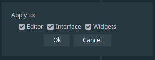
Open Tools - Color Scheme Editor. Pick Interface in the dropdown menu and paste the CSS to the right textarea, click Apply. That should do it. Don’t forget to check these boxes.

Note: if you’re using a built-in color scheme, you have to create a new one (click New, it will fork the scheme) because you can’t modify default color schemes.
