I’ve just discovered Komodo Edit 9.3.2 after using Komodo Edit for years, most recently 8.5. My first reaction was that my monitor had broken as I was looking at an old style glass teletype from about half a century ago (yes, I am that old!). All the other ‘options’ were clearly for people who spend their whole lives in some sort of drug induced haze (and a ‘twittter’ poll of 50 is hardly a massive endorsement, unless that’s about 50% of your user base…) I wanted something like 8.5, even if I could just change the background colour to something that doesn’t mask all the code. But no.
I tried loading the tabula rasa skin and setting the background colour to white which gave me - a tabula rasa, a big blank window.
I’ve uninstalled 9.3.2 and gone back to 8.5. I’ll soon move to a different tool entirely.
Strong opinion. That’s great! It’s unfortunate you haven’t given us a chance to help you address your problems though.
If you actually want assistance, what is that you need? A colour scheme from 8.5 and the classic style skin? You covered the “don’t wants” pretty well but I’m not 100% what the “wants” are.
In particular the newer Tabula Rasa skin/theme is pretty great for tweaking and twiddling your theme.
While we’re on that topic, I’ve never had any luck with Stylish as an addon/package, hoping 10 integrates it somehow. You might also have some luck with that.
Lastly there used to be something somewhere about customizations via user.css or something, but I can’t remember what it was. Anyone?
@andygegg in my oppionion the user experience of 9.* is better than that of the 8.* releases of komodo edit.
From your answer it looks like you finding it difficult to customize 9.* to your taste, than that you are having usability issues.
That said can you maybe give us a hint from what you’re looking for (dark/light skin/colorscheme).
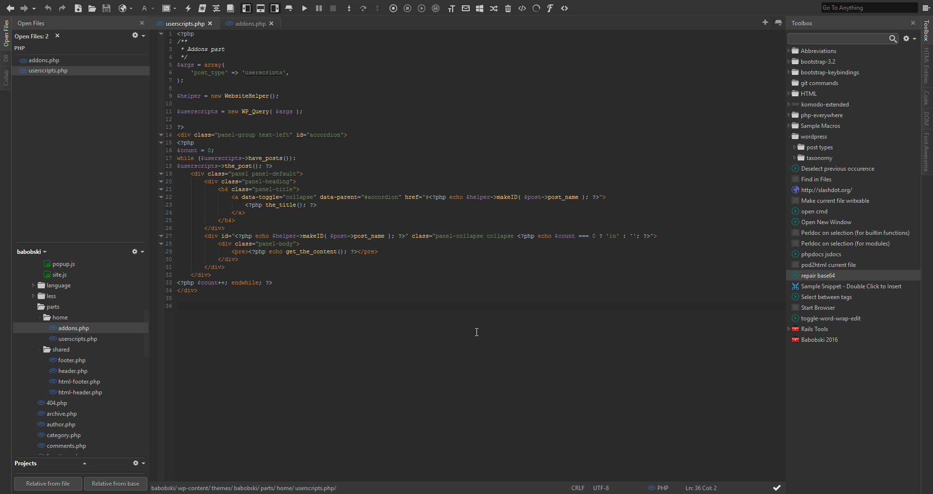
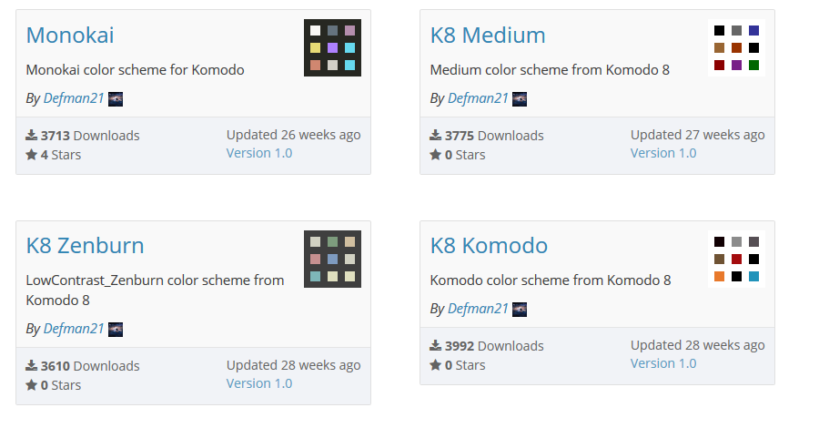
If you like a dark skinned editor, you can try my Deep Focus Skin, i also updated some colorsheme’s(can be found here) to match the background of the editor, so you can just install the color scheme and don’t have to adjust the background.
And if you are looking for the same color scheme as in Komodo 8.*, you can search for the same color scheme. @Defman ported i think most of the color scheme’s from Komodo 8 to 9, these color schemes are prefixed with k8:
As I said, I tried Tabula Rasa but when I tried to change the background colour it reduced the whole thing to a heap of rubble (super trendy black rubble, of course!) with no way of recovery other than to uninstall.
Many thanks to you all for your replies; my apologies for not responding sooner. I’ve calmed down now!
For background, I’ve coded on paper tape, punched cards, paper-and-keyboard teletypes and black-on-green “glass teletypes” connected to mainframes you’ve never heard of. vi is hardwired into my motor neurones. I’ve used many generations of numerous IDEs on generations of Windows and generations of Unix and Linux. I know just what a powerful tool a good IDE is. But an IDE is a tool not a fashion product; it has to be usable and that means being able to sit in front of it hour after hour, day after day without the tool itself being the problem.
For me, that means a white (or preferably very light grey) background colour. There’s a reason why books, newspapers and serious magazines are black ink on white paper. Reading white on black or lime green on fuchsia is seriously hard work, the eye is too distracted.
So when the 9* version of KE says “you can have any colour you like as long as it’s black” I was not impressed. The light versions of faint pastel on slightly fainter pastel I find completely illegible, the dark themes give me a headache.
All I want is to be able to choose the background colour - the one thing you explicitly exclude! I use, and have used, too many IDEs to care about syntax colouring (making comments distinct is nice; being able to see what text is selected is pretty vital and being able to read the selected text - which your light themes make impossible. Other than that, I neither notice nor care).
Why you ship with ONLY black or (censored) options is beyond me and then expect your users to scurry around trying to find something usable. I gather black on black colour schemes are considered jolly clever by the twittering classes; I like to think that if they go on to write serious code they’ll learn the error of their ways. Or not, I don’t care, I’m not trying to impose my preferences on everybody else - that seems to be your job!
Tabula Rasa is an unstable skin meant for those who are ok with testing experimental software. If you are not one of these people please refrain from installing it. Additionally if you can’t find yourself in the aesthetics of a skin … don’t use it? I appreciate you don’t seem to like modern interfaces but can you please express yourself in a less hostile manner?
As for your followup post, I don’t mean to be rude but none of the things you said are correct. Everything you complain isn’t available is in fact available. You may fault us perhaps for not making it as intuitive as it could be, but I think it would be more productive if you were to come to our forums asking for assistance or feedback on how to do something rather than outright assume the worst.
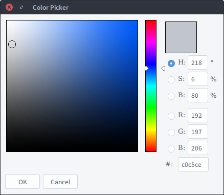
I don’t think I would use the words unusable or revolting but things could be better. I finally managed to make a scheme that I can tolerate. The provided color picker is lame. I used the one in my Linux terminal, it has an eyedropper that you can use to get the Hue, Saturation, and Value numbers from the color you want. I am not into skins and jumping through hoops to customize stuff so good enough is good enough. Some examples of skin effects and scheme choices in the on line documentation would go a long way to helping first time users. I am close to cataract surgery so stuff like dark gray on light gray is intolerable. Black on the color of a file folder is better. Did it.
(great rant by the way)
Lou
What’s wrong with the default color picker? It has Hue, Saturation and Value. But I agree that the lack of an eyedropper is bad. AFAIK a new color scheme editor will be in Komodo 10 which should make the customization process much easier!
Curious, I always felt the thing that was missing was a “preset” picker where you could eg. select a color that is used elsewhere in your color scheme.
A color picker to me is far less helpful in this regard as it often requires you to make pixel precise selections which are often inaccurate due to anti-aliasing.
Just to chime in here, yes I’ve been having the same feelings about the colour schemes, I mean who set these up? A colourblind person?
Why are devs asking users to make changes to CSS files in order to get the basic colour scheme setup for their use? Madness!
At the minimum, the editor should come with 2 basic colour schemes - light and dark. Both should have good contrast between the background and text. This does not seem to be the case. I am using a light colour scheme for my widgets and a dark one for the editor. I am continually having to squint to be able to read the filenames in the sidebar, because the contrast between background and foreground is so low.
Im able to set this somewhere in config I hear you say? I’ve been using komodo for the last 4 years or so, in all that time I still havent found an option which will let me simply change the text colour in the sidebar widget so its a bit darker. I’ve managed to find places where you can set colours for the close button. The f*****g close button! I just want the basics - changing the colours of the editor and the widgets around it, not the level of granularity which makes you get lost amongst all the options as soon as you open the “colour scheme editor”.
Why are the basics not setup to enable users to pick from at least dark and light colour scheme, which will have a default contrast set properly for text/background? I feel a young dev has taken up this part of the komodo development and made a big mess out of it. Too complex! Simplify!
Sorry its a rant, but this has been bugging me for so long, I know someone will come along and go “yeah open the customizer, and clik here and there and you will be able to set it”. Well this shouldnt be the case, I should be able to quickly and easily find this and modify myself.
We are not. We provide 17 default color schemes in the basic install. 8 dark, 9 light.
See above.
Re: the level of granularity in the options:
That’s perception. We’ve had users tell us they love it. I believe the original idea was that generally devs want fine control which isn’t true all the time but is a very very common. We’re happy to help you make the changes you want but that’s not why you’re here, you’re here to voice your opinion, which is fair.
I don’t understand this. As mentioned above we provide 17 schemes, basically and even split of light and dark.
So you’re main issue is that it’s not clear how to modify specific aspects of the UI based on the items in the list of properties to set, correct? Based on your current request (text in the sidebar) this seems like a fair observation. The property to set the text in the Places pain is called panel. I’m not sure why that name was chosen but it doesn’t make it’s usage clear to me.
It’s ok but come ask us for assistance before you get this riled up next time. We’re happy to help.
Lolz thanks for the quick response and being so understandable.
Yeah, its not actually so much the fact everything is available to be changed, but the fact you get lost amongst the options not knowing which option is for what. And going through blindly changing everything to find what changes the left side panel by trial and error is not something I wanted to spend my time on.
Yes there are a number of themes pre-set, this is great. however picking any light theme for widgets makes this panel have really low contrast between text and background. Seems like this panel was overlooked when setting up all light themes. All dark themes seem to be setup properly for it. I dunno, maybe people do not use the recent files panel as much as I do. Usually I have 10+ files open so the panel is definitely handy for me, instead of the tabs at the top.
Despite the colour scheme issue and a few other bugs which I noticed within the preferences panel, Komodo is still an editor of choice for me. Doesnt crash, doesnt waste a lot of battery power when sitting open on my laptop, and just works. Keep up the good work guys.